Bibaswan
I design enterprise systems
that people actually use.
Senior UX Designer specialising in complex B2B SaaS — reducing friction, driving adoption, and closing the gap between what products promise and how people actually work.
Projects that
moved the needle
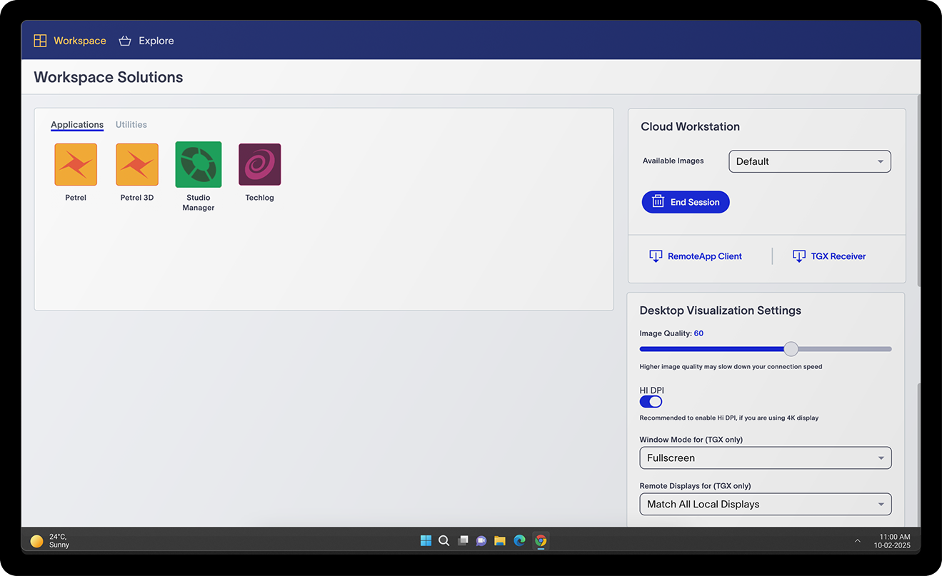
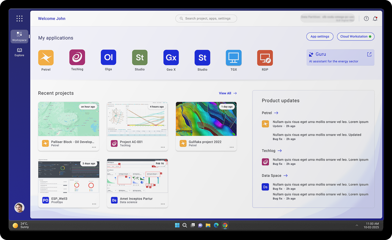
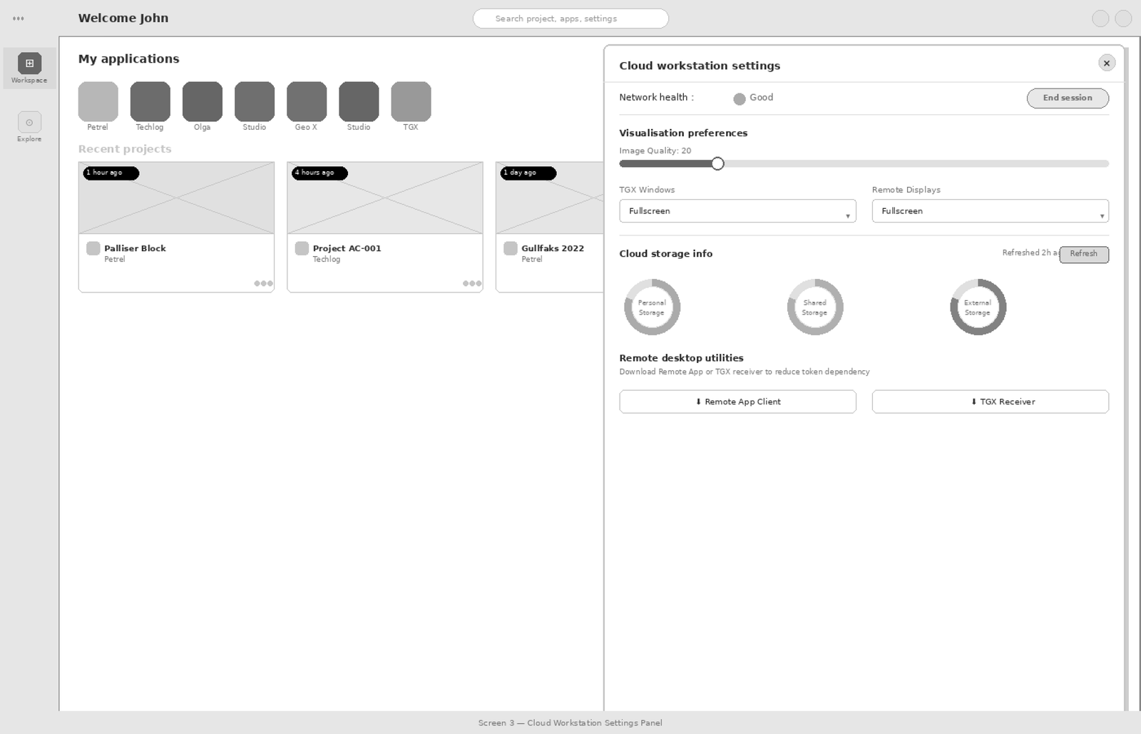
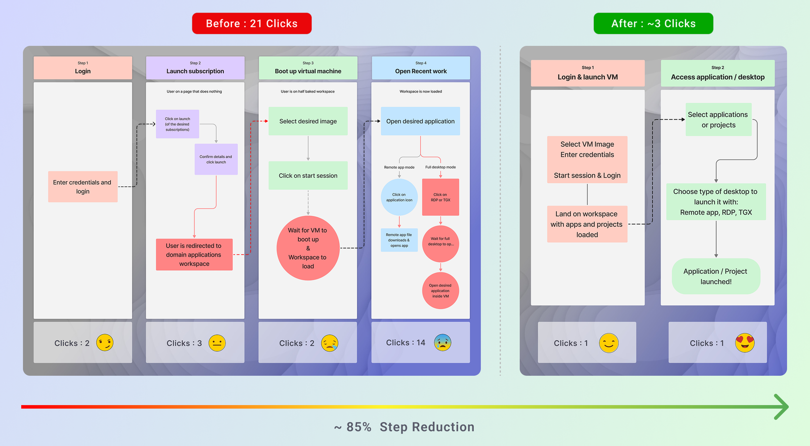
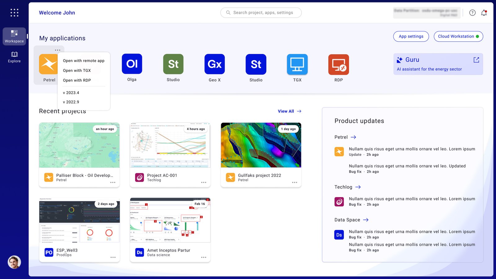
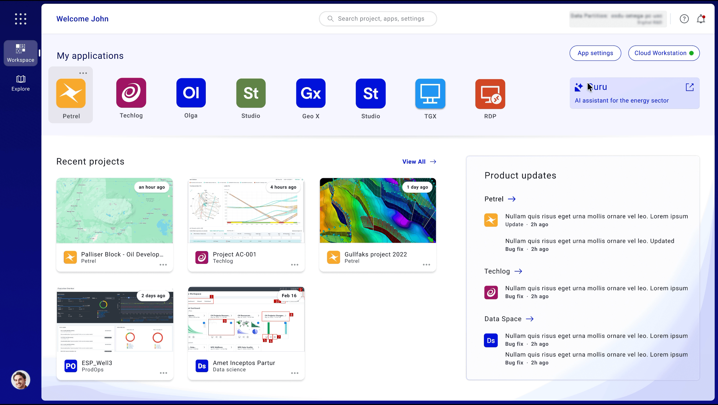
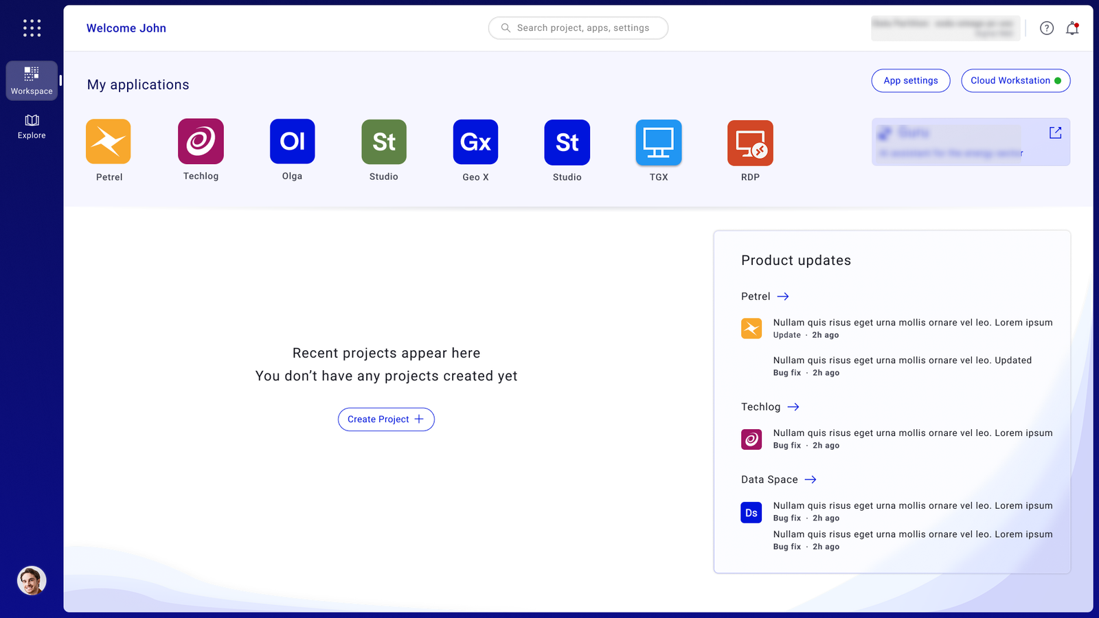
Reducing Enterprise
Workspace Friction
by 67%
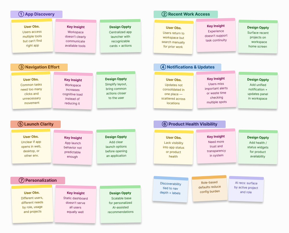
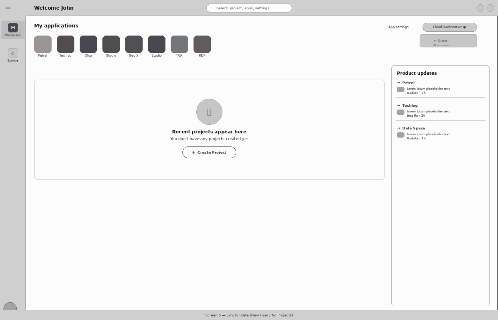
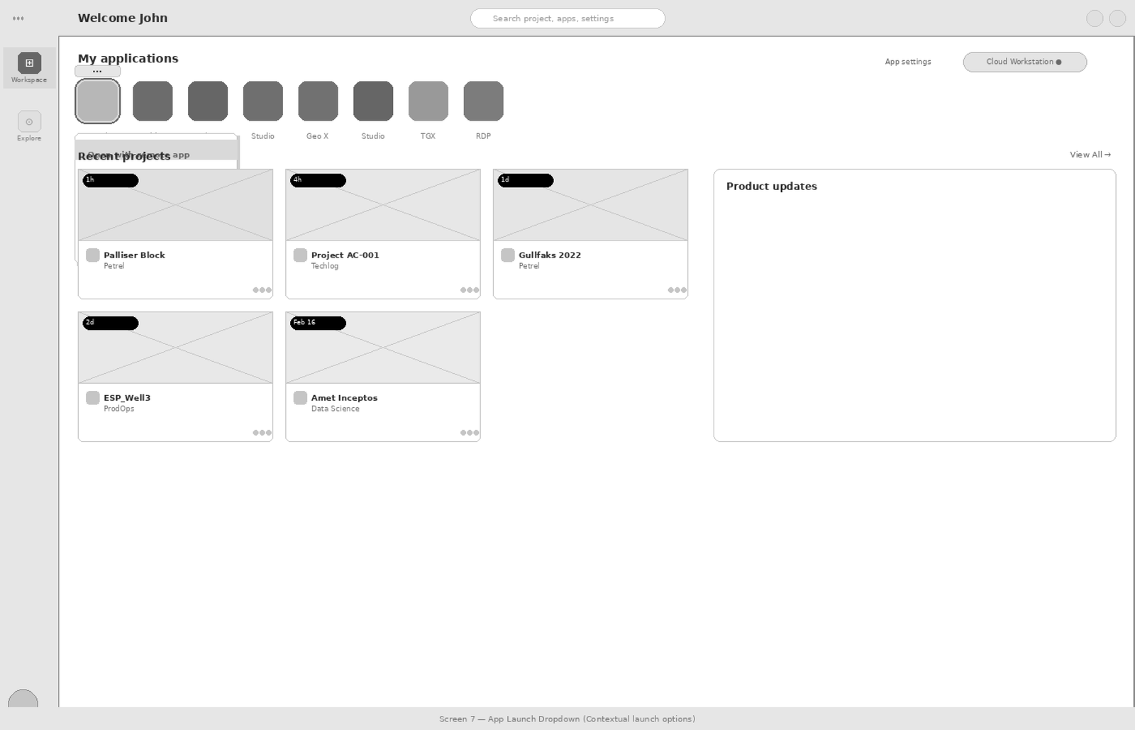
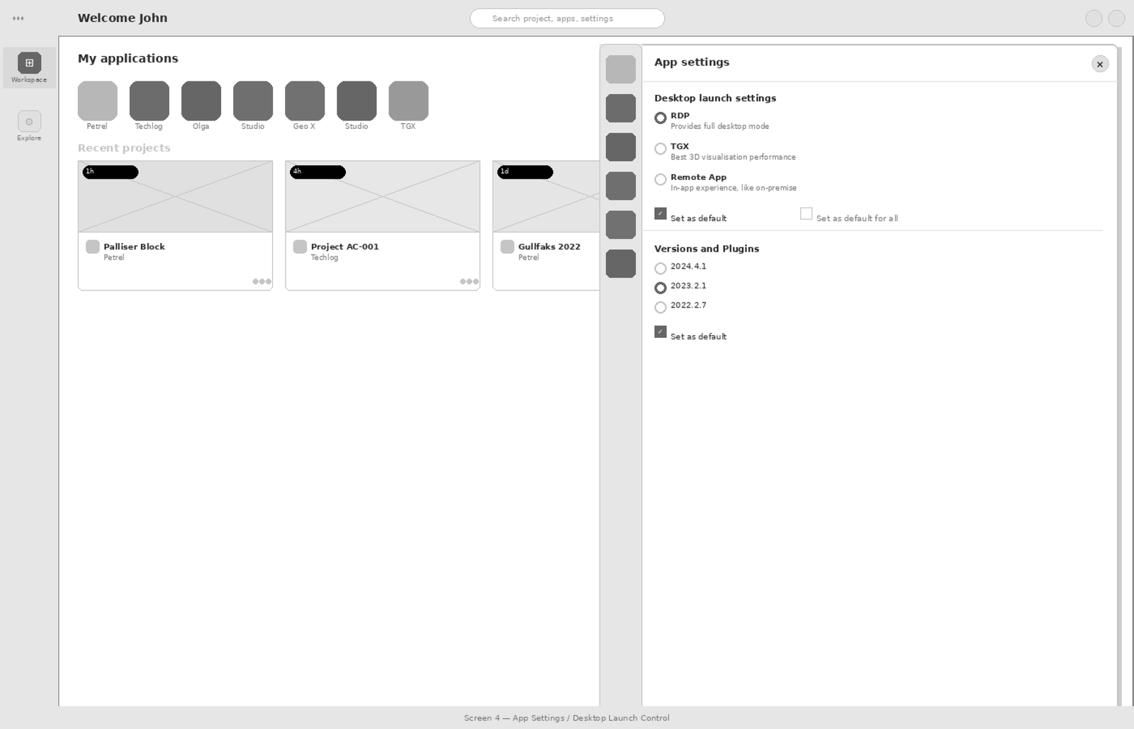
Redesigned a mission-critical geoscience workspace to unblock cloud migration — reducing core task completion from 21 clicks to 3.
100% Team Adoption in 2 Weeks
End-to-end redesign of a clinical reporting tool — from zero engagement to full team adoption through targeted workflow intervention.
Design System for Complex Domain Workflows
Scalable component library and design language for a multi-product enterprise platform serving domain experts across global teams.
Outcomes over outputs.
Always.
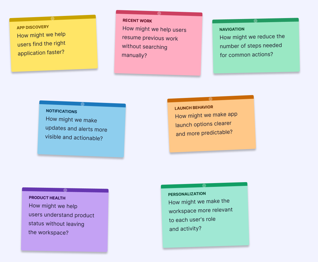
Enterprise work fails when designers don't understand what users actually do. I embed in the domain before touching a screen.
I find where workflows break — not where they look broken. Click depth, cognitive load, and task failure are the real diagnostics.
Every screen is a decision point. I design for the choice users need to make — not the feature the team wanted to ship.
Design is a hypothesis. I test it, instrument it, and hold myself to the outcome — not the deliverable.
What they say
His work is impeccable and has the rare quality of simplicity.
His design solutions consistently drove stakeholder confidence and accelerated project momentum.
Bibaswan is one of the most extraordinarily talented people I have worked with.